Identity
Moniker
The new identity for Moniker was supposed to be a simple, mainly typographical set of rules to provide a stable base and accompany the mostly visually very detailed projects of the studio inconspicuously.
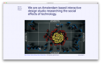
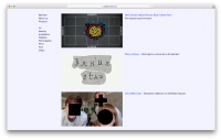
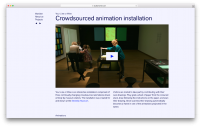
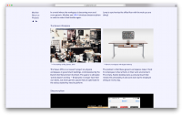
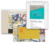
It was applied on new document templates, website and e-mail newsletter.
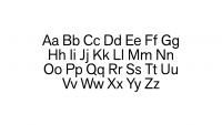
As a new font Akzidenz Grotesk Next Regular was finally choosen. It represents diverse applicability, simplicity and interesting details at the same time.
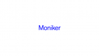
The name, set in the new font, was not meant to be a new logo, but stands for the new indentity. The pure rgb blue was taken from the old identity.
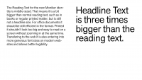
Basically there are only two font sizes. After choosing a font size for reading fitting the format, the headline size ist generated by multiplying it by three.
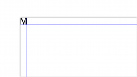
For defining the margins of a document the capital M of the resulting headline font size is providing the dimensions for the upper left corner. The right and bottom margin are generated accordingly.
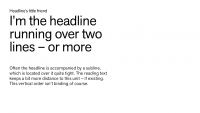
As a little structural specification a subline and spaces in between headline and text were defined.

As a footer of every document the name and web-address is set in reading font size with space of two Monikers in between.
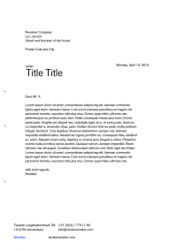
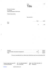
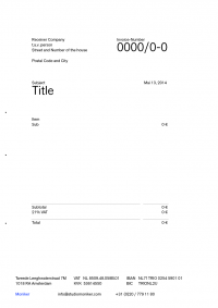
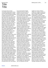
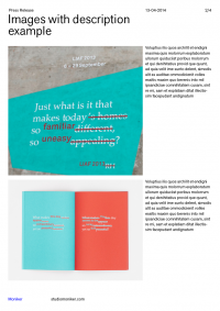
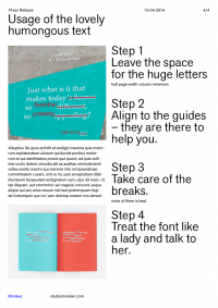
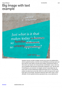
The identity was then applied on templates for offers, invoices, letters and different purposes.
Beside further video title and screen presentation templates, a new website and an e-mail newsletter have been designed following the new identity.
