Het Nieuwe Instituut
Website
Together with Moniker I designed the website for Het Nieuwe Instituut. It was based on the new identity by Maureen Mooren and originated in collaboration with her.
The website based on the idea of interactive covers for every project of the institute. Because technology in art and everyday life is a strong focus of the institute the covers were supposed to involve digital artists and designers more into the institutional communication.
The final design was mainly build on equal dividing of the format and centering contents. The typography is limited to only one font style and three font sizes, combined with lines.
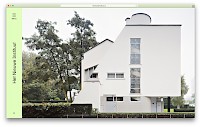
Homepage with cover
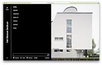
Opened menu
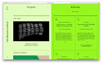
Agenda Page
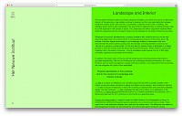
Text Page
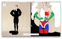
Project homepage with fullscreen cover
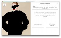
Project homepage scrolled down
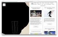
Listing
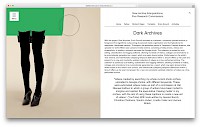
Project Text
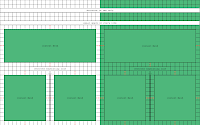
Grid Explenation from the styleguide